Notion Chart View: How to Visualize Database Data
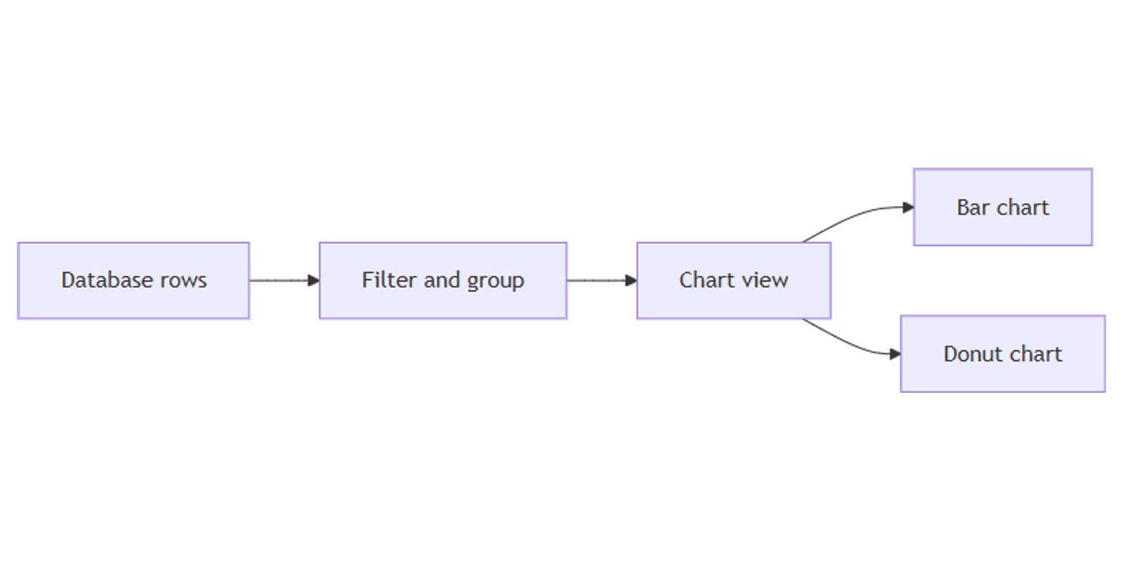
Notion chart view turns any database into a bar chart, line graph, donut chart, or single number - without exporting to Excel. Filter, group, and aggregate your data in place, then switch back to a table or board to edit the underlying rows.
This guide covers how to add a Notion chart view, configure every chart type, and build dashboards for tasks, finances, and form responses. See Notion's chart documentation for official details.
What is chart view?
Chart view is a read-only database layout that visualizes the same rows as your table, board, or calendar. Change a property in another view and the chart updates automatically.
| Chart view | Table / Board view | |
|---|---|---|
| Best for | Totals, trends, at-a-glance reporting | Editing and moving entries |
| Edits rows | No - read-only | Yes |
| Shows | Aggregated bars, lines, or numbers | Individual rows and properties |
Use charts when you want to see patterns - tasks by Status, expenses by category, form responses by month. Switch to a table or board to change the data behind the chart.
Plan limits: everyone can try charts. Free plan: one chart per workspace (delete it to create a different one, or duplicate a chart from a template). Paid plans: unlimited charts.
Charts support up to 200 groups and 50 subgroups at a time - use filters on large databases to narrow the results.
How to create a Notion chart view
Option 1: Chart view on an existing database
- Open the database you want to visualize.
- Click + next to your view tabs (or Add view in the view dropdown).
- Select Chart.
- Name the view (e.g. "Tasks by status" or "Revenue by month").
- Open the chart settings panel to choose chart type, axes, and aggregation.
Option 2: Standalone chart block
- Open any Notion page.
- Type
/chartand select a chart type (Vertical bar chart, Line chart, etc.). - Link an existing database or choose New chart to create a fresh database.
- Configure the chart in the settings panel.
Standalone charts work well on team dashboards - add several /chart blocks on one page, each linked to a different database or the same database with different filters.
Chart types explained
Notion offers five chart layouts:
| Chart type | Best for | Example |
|---|---|---|
| Vertical bar | Comparing categories side by side | Tasks per Status |
| Horizontal bar | Long category labels | Projects by client name |
| Line | Trends over time | Submissions per week |
| Donut | Part-to-whole breakdown | Budget split by category |
| Number | One headline metric | Total open tasks, sum of revenue |
Vertical and horizontal bar charts
- X-axis (category): pick a Select, Status, Person, or Date property to group by.
- Y-axis (value): choose Count (number of rows) or an aggregation on a Number or Rollup property - Sum, Average, Min, Max, or Median.
Example - tasks by status:
- Chart type: Vertical bar
- X-axis: Status
- Y-axis: Count
Line charts
Group by a Date property to show how values change over time.
Example - form submissions per week:
- Chart type: Line
- X-axis: Submission time (or Created time), grouped by week
- Y-axis: Count
Works well after collecting data with Notion forms.
Donut charts
Show how a total splits across categories - useful for budget categories, tag distribution, or priority breakdowns.
Example - expenses by category:
Number charts
Display a single aggregated value - total count, sum, or average. Use on dashboards when one number matters more than a full chart.
Example - open tasks:
- Chart type: Number
- Value: Count where Status is not Done
Configure filters and grouping
Chart views support filters independent of other views on the same database.
Common filter setups:
- This month - Date is within This month (rolling reports)
- Active only - Status is not Done
- My items - Assignee is Me
- High priority - Select Priority is Urgent
Filters apply only to the chart view tab - your table and board views stay unchanged.
For grouping nuances, the chart settings panel controls how categories are bucketed (e.g. date by day, week, or month).
Practical workflow examples
Form responses by category
On a database with form submissions and a Category (Select) property:
- Add a Chart view named "Responses by category".
- Chart type: Donut.
- Slice by: Category.
- Value: Count.
Pair with a Table view filtered to this week for details.
Content calendar - posts by platform
On a content database with Platform (Select) and Publish date (Date):
- Chart type: Vertical bar.
- X-axis: Platform.
- Y-axis: Count.
- Filter: Publish date is within This month.
Works with the Social Media Multi-Platform Content Planner.
Income tracking - revenue by source
On an income database with Source (Select) and Amount (Number):
- Chart type: Horizontal bar.
- X-axis: Source.
- Y-axis: Sum of Amount.
Pair with the Income Streams Tracker or Money Management template.
Task completion trend
On a tasks database with Status and Completed date (Date):
- Chart type: Line.
- X-axis: Completed date, grouped by week.
- Y-axis: Count where Status is Done.
Build a chart dashboard
Combine multiple charts on one page:
- Create a team hub page.
- Type
/chartand link to your tasks database - show open tasks by status. - Add another
/chartfor the same database with a different filter - e.g. overdue items. - Add a third chart linked to a separate expenses or CRM database.
On Business and Enterprise plans, use a Dashboard view (up to 12 widgets) instead - see database views for the overview.
Export and share charts
To share a chart outside Notion:
- Open the chart view.
- Click ••• at the top right.
- Select Save chart as → PNG or SVG.
You can also copy the database page link - viewers with access see the live chart. For static reports, export as PNG and paste into slides or email.
Note: you cannot export chart view data as CSV from the chart itself. Open a Table view and use ••• → Export if you need a spreadsheet.
Chart view vs other views
| Goal | Best view |
|---|---|
| See totals or trends | Chart |
| Edit individual rows | Table |
| Move items through stages | Board |
| Collect new entries | Form |
| Multi-widget overview | Dashboard (Business+) |
Many databases use Table for editing, Board for workflow, and Chart for reporting - all on the same data.
Permissions and troubleshooting
Who can create charts: any workspace member with Can edit access to the database.
Common issues:
- Cannot add another chart on Free plan - you get one chart per workspace. Delete the existing chart or upgrade for unlimited charts. You can duplicate a chart from a downloaded template to use it on Free.
- Chart looks empty - check filters, confirm the X-axis property has values on your rows, and verify the date range includes your data.
- Too many groups - narrow with a filter; charts cap at 200 groups and 50 subgroups.
- Cannot edit from chart view - expected. Switch to table or board to update rows.
- Number property shows wrong total - confirm Y-axis aggregation is Sum (not Count) and the number format is set correctly in the database.
FAQ
Are Notion charts free?
Yes, with limits. Free plan: one chart per workspace. Paid plans: unlimited charts.
Can you edit database rows in chart view?
No. Chart view is read-only. Use a table or board view to edit entries.
What chart types does Notion support?
Vertical bar, horizontal bar, line, donut, and number charts.
Conclusion
Notion chart view turns database rows into visual reports - add a Chart view or /chart block, pick a chart type, set your axes, and filter to the data that matters. Pair charts with forms for intake, Status for workflow breakdowns, and Number properties for sums and averages.
For multi-widget overviews on Business plans, see Notion dashboard view. For all view types including board, timeline, and calendar, see Notion database views. For filters that scope your charts, see database filtering.
Notion Templates
Start Selling Notion Templates - Start Now!